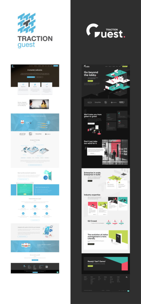
Salmon pink, lime green, teal. Environment illustrations with stories behind each element. A radically different logo.
With a night and day transition from where we have been and where we are now, you might be curious on how we got to this point.
The short answer is, we just opened our eyes and leaned our ears in a little closer.

Over the years, we’ve surveyed thousands of professionals involved in managing visitors and helped hundreds of organizations along the way. Every conversation and interaction taught us something. After several years of analyzing industry insights, three consistent themes stood out: people, security and data.
We wanted to align our visual identity with what was important for our customers.
With the brand identity inspired by the visitor management drivers, we needed to make sure that the overall experience was authentic to our culture and values. An identity that was inspired by our industry and the challenges around it. Design that was distinct and consistent across all channels. A visual representation that provided value and inspiration to professionals using visitor management.
With all this in mind, we came to the perfect makeover.
The logo

Highlighting people focus in our logo and overall brand was essential.
People are at the heart of visitor management. As guests, they want to feel welcomed, safe and remembered. Seamless visitor experience helps organizations to collect required visitor data, and in turn, enables security of facilities and safety of employees and guests. On the flip side, people are also a big part of our culture and connection to community.
The salmon pink dot in our new logo is a constant reminder that our purpose is built around people. Their safety, their experience, their trust. That dot is a core visual element throughout our site. It is frequently represented as a period for our headlines as well as within the illustrations.
When you look at the bar in the letter "G", you can also spot an element of the opening or closing of a door. That’s another recurring theme of access and security in our new brand represented in the logo and in angles, patterns and illustrations throughout the platform and web.

Visitor data was another theme was part of the logo inspiration, leveraging the circle of the pie graph in the “G”. Capturing and managing visitor information is at the core of compliance requirements and proactive security procedures. This focus on visitor data is represented in animations and design elements in the new identity. As compliance and security are reported as key benefits of VMS, data is a critical component of VMS strategy.
Colors
Transitioning from a predominantly blue, white and grey color palette to our current one was a drastic change.

We chose colors and the other brand elements consistent to who we are. Fun, approachable, aspirational, passionate and bold. Like our approach to the customization and flexibility of our platform, our color palette is unlike anything in our space.
We intentionally made the color schemes and tones warm and welcoming. We adjusted the contrast to accomodate readability and accessibility standards across all digital experiences. Our new colors allow us to be distinct and flexible, whether it is on our website, business cards, tradeshow booths or branded clothing.
Illustrations and style

Organizations welcome visitors across multiple locations, through different entry points, via different journeys. Managing guests at scale emerged as a challenge for enterprise organizations driven by compliance, security and safety industry standards.
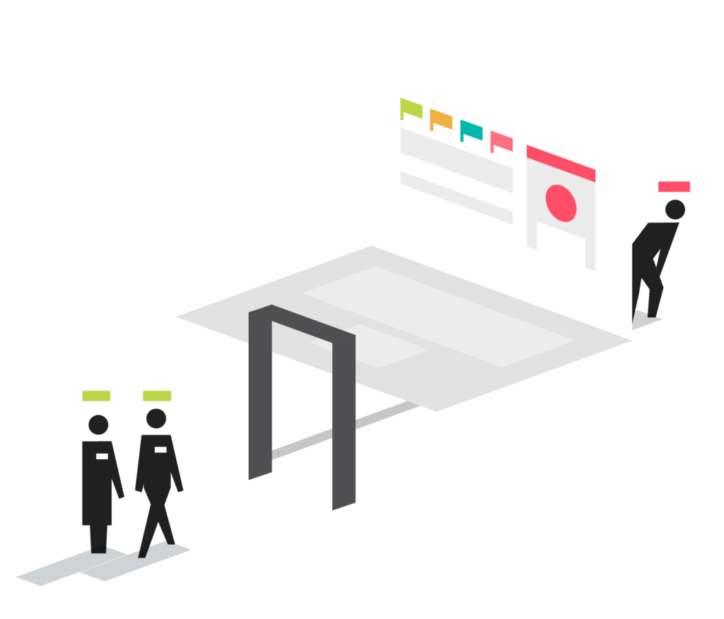
Whether guiding visitors to the right entrance or parking area or verifying IDs at the gates, visitor management impacts organizations beyond their lobbies. We wanted to show the complex environments security and facility professionals have to manage. By showcasing the workplace environment through 3D illustrations on our website, we were able to demonstrate how we protect people and sites.

It was a way we could create different environments, scenarios and multiple locations. We used one isometric grid system to accommodate this vast amount of environments that we cover from campus sites to parking lots to industrial sites to events.

Managing risk levels associated with visitor access in relation to multiple organizational objectives. The visual of an open door represents need for proactive security, managing access levels, leveraging watchlists and other processes related to facility security and employee and guest safety.
Photography
The definition of a brand is a collection of memories. Every time someone interacts with our brand is one memory. The more touch points they have with our brand, the stronger the relationship we build, the bigger our community grows.


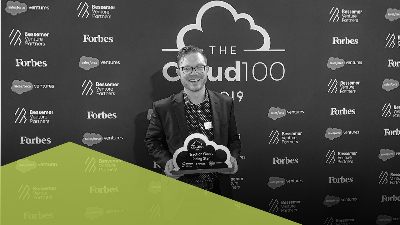
Our style of photography is one of the major ways we can create memories. By leveraging black and white while accenting our new colors, we can give our photos their own unique look and feel and make them instantly recognizable.
The next generation
We have always said that our VMS goes beyond the lobby. We had similar thinking when it came to our visual evolution.
Building on our unique origin story with the vision for our future, we were able to develop a brand identity that tells a story while celebrating our people, culture and vision. We want to show you how we have evolved.
